Moovie
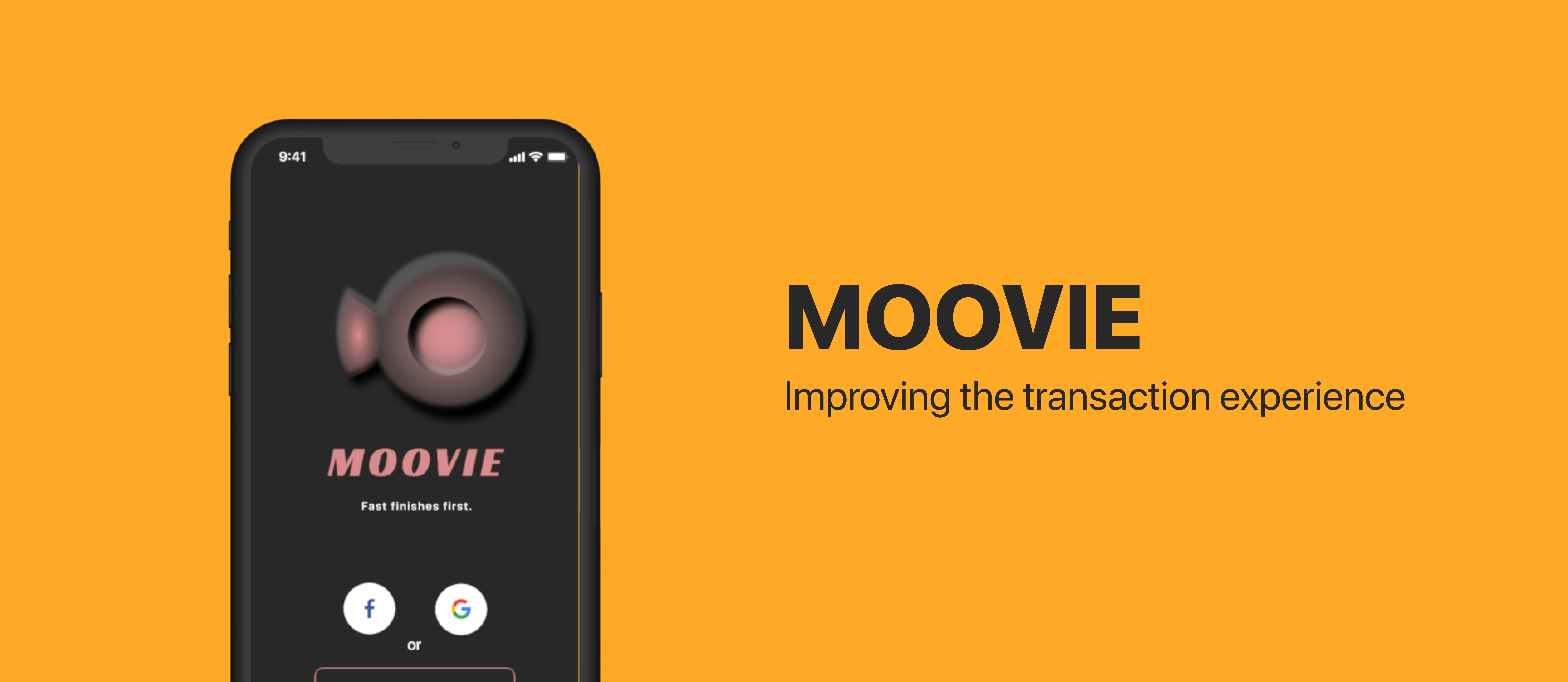
is a movie-booking application that allows users to transact their movie tickets with their own individual mobile payment in a faster way securely. Also, the application enables users to purchase multiple movie tickets for their friends; this allows the users to share the electronic movie stub which indicates the movie title, date, and the theatre on social media.

Due to COVID-19, I worked the whole project independently in terms of the user experience research and the user interface design. Throughout four months of study, I was able to collaborate with five interviewees from The University of Queensland regarding their experience of movie booking application, researching through three UX evaluation including Co-Design method in Low-fidelity prototype evaluation, System Usability Scale (SUS) in Medium-fidelity prototype evaluation, and Technology Acceptance Model (TAM) in High-fidelity prototype evaluation.

In response to the user interface of Moovie, I have implemented some design principles and HCI theories, including Gestalt psychology, Fitts’ law, and Hick’s law in the hope of making the intuitive and accessible interface.

Duration
4 months // 2020
Role
UI/UX Designer and Researcher
Reading Time
8 Minutes

Improving the
Transaction Experience

The brief was originally given to improve the transaction experience through the interactive systems, attempting to design these interactions so that people can engage with them, making sense of them and using them effectively.

To delve into the research on what obstacles people may encounter regarding the transaction during the time they are using the movie-booking application, I have interviewed the end-users for receiving the insightful feedback. The majority of interviewees have mentioned that
compared to mainstream products or platforms nowadays, typing their credit card information on a relatively untrustful application makes them feel the sense of insecurity.

To address the identified issues, I established and researched the conceptual design, including the problem statement, interaction mode, metaphors, design guideline from Material Design and Human Interface guideline, and the system requirements. From the visual components to user experience design, the user interface and user experience have positively revised through the three rounds of design iteration.

Preparation -
Key Research Insight

After interviewing people regarding their experience on the existing movie-booking application and movie theatre, I sorted the raw data to the affinity diagram to see if there are some clues I can improve and design. I mainly researched on what decisive actions make individuals go to see the movie and what problems they have when seeing a movie in a theatre. Through the affinity diagram, I found the discovered issues that:

People feel annoying due to the lengthy payment process and unclear user interface
In average, people are likely to watch movies around five to ten times per year
More than fifty percent of the participants book and pay their movie tickets online
Reviews, timetable, and seat selection are three crucial factors when seeing a movie
Only twenty percent of interviewees have experienced going to see a movie alone
People tend to keep their movie stub and post it with their thoughts on social media

Low-Fidelity Prototype
and Sketches

Before sketching the lo-fi prototype, I have set three initial features that need to have on Moovie, including completing the transaction fast and securely, being able to share the purchased ticket on social media, and providing the best seat selection for the users.

Some HCI knowledge and notions were used in Moovie. For example, dark pattern and nudge used in Login page are the two most common artifices to catch people’s attention. Also, the home button in the main page is one of the metaphor examples to show the users that the button is used to return the home page.

UX Goals
and Revision

Based on the feedback and the pain points received from the interviewees on stages of evaluation with the prototype, the participants have proposed many suggestions regarding the user and customer experience and their confusion of the design. From the lo-fi prototype evaluation to hi-fi prototype evaluation, the design and UX goals have changed multiple times to meet the participants’ expectation.

On top of that, I have recorded the participants’ emotion when they are doing the user testing session. This helps me to understand what the actual feeling that the users perceive the designed prototype. In consequence, I concluded the finalised UX goals that:

Source

“Since I have never been to the movie theatre that shows on the screen by default, I don’t really know where the place is. Also, the distance is a decisive factor whether I will actually go to the movie theatre, I need to have a general idea of how close the theatre is.” - P2

UX Goals

I would love to see if there is an affordable ticket I can buy or a list of selection I can choose my taste personally.

* The sorting system should be logical and meet the user’s need.

Measures

Setting a sorting system allows the user to select what the factor they mostly care about. A range of the sorting can be set in this design. And they are the following: 1. (Date) New to Old 2. (Date) Old to New 3. (Rating) Low to High 4. (Rating) High to Low.

Requirements

Requires the API data of each movie’s date and the rating.

The sorting system should be placed in a noticeable place in the main page.

Source

“When I looked at the main page, I noticed that the movie is ordered by the rating. However, the top of the movie does not meet my taste. Also, I cannot see the price of the movie ticket. It gives me an intangible stress whether the movie ticket is expensive or not”. - P3

UX Goals

I would love an actual map that shows the distance between me and the movie theatre.

Measures

Set a map that shows the route between the user’s location and the movie theatre. Also, the map needs to display the approximately arrive time to the users for them to decide whether it is worth to take time to go to the theatre.

Also, the map navigation should provide other movie theatres, allowing the users to select different movie theatre.

Requirements

A map that can show the distance between the user’s location and the theatre. Also, the system needs to have an ability to calculate the travel time to the theatre.

Place an input section for the users to type the movie theatre they are looking for.

Source

“The login page seems illogical for me since the users would only see “Email or Account” and “Password” after the user clicks “Sign Up” button. Also, I hate to input or create an account for every application. This makes me feel extremely annoying.” - P2

UX Goals

I would love to see a clear logic login page with a multiple access way such as creating the accounts with social media such as Facebook or Instagram.

Measures

Redesign the login page. Remove any input in the login page in the hope of meeting the design guideline of simplicity. Make Facebook user and Google users directly access to the system in a faster way since most people have at least one of the accounts from both.

Requirements

If the users do not have Facebook or Google accounts, then they need to create an account from the application, which means a database to store the users' information is needed

Source

“The users are not able to check what they purchased before proceeding the payment. This may cause the problem that the users will likely to purchase a wrong item that they do not want.” - P5

UX Goals

I would need to see a summary of the payment detail after going to the payment process.

Measures

Set an overview of what the users have selected when they have entered the checkout page

Requirements

Design an overview page that includes the time, the name of the product, the unit, and the total amount of the price.

A mobile payment button (e.g. Apple Pay and Google Pay) to finalise the transaction.

Source

‘the pop-up section which contains with the context, the “buy now” button and the “see trailer” button has poorly designed due to the given tight area. This pop-up section should have one individual page’ - P5

UX Goals

I would want to see the trailer, description in one page as this may reduce my steps when using the application.

Measures

Redesign a page that has the trailer, description of the movie, and the next stage of the process in a single page.

Requirements

Create one individual page for the see detail section.

Have a vivid Call To Action (CTA) button allowing users to follow the next step of his task.

Source

“I have previously gone to the movie theatre in a group of ten people. Since the maximum number is capped to six in this design, I found the design at the pre-setting page does not cover to those who usually go to the movie with a large group of people.” - P1

UX Goals

I would love to see if the users can customise and decide the number of people the users want to invite.

Measures

Design a space that allows people to choose the number of people they want to invite to see the movies together on the pre-setting page. This can be done in the selecting section. Once the user clicked the customisation section and selected the number of people, pop-up section that the users can input the specific number.

Requirements

An extra space to design the customisation.

User Interface
Design

High-Fidelity

Medium-Fidelity

Available on Figma

The user flows above showcases what the user will experience when purchasing the movie tickets on Moovie. As the usability and accessibility are two most pivotal factors when assessing whether the product is usable and intuitive, the prototype has heavily followed the colour consistency and design theories, such as Hicks’ law, Fitts’ law, and Gestalt principles [1].

Also, the user flow process has simplified in the hope of making the users minimise the memory load and potential confusion of the interface. From the home page, the user would be able to check the most available time when the movie starts. If a user wants to check the movie information from the list of movie cards, Moovie would display the nearest movie theatre, and seat selection by only making a few steps. This links back to the UX goals where the participants mentioned their pain points of the current existing application.

[1] The explanation and analysis of how Gestalt theories are used in Moovie is available here

User Experience
Evaluation and Analysis

Throughout the SUS method in medium-fidelity prototype evaluation, the result has shown that the usability and accessibility do not reach the user experience sweet spot. The participants have mentioned error prevention, aesthetics, and the ambiguous user journey when selecting the number of people before choosing the movie. Nevertheless, the users cannot associate with the movie stub icon as the signifier is not clear enough. The colour and border-radius are not consistent so that the users may have a negative experience when using the application.

With the participants' insightful feedback, I leveraged the opportunity to revise and redesign the user map and the design elements. Through the TAM method I used in High-fidelity prototype evaluation, the accessibility of the application has significantly improved since the score of "Perceived ease-of-use" are reached to the highest score. Additionally, regarding the usefulness of the application, the responses have shown that the application is believed to improve the application's UX goals, proving that both accessibility and usability have enhanced due to the changing user journey.

To sum up, throughout the evaluation, the usability, user accessibility, UX goals, and the user interface, Moovie has enhanced its user experience at each stage. However, the prototype undoubtedly needs to do more evaluation cycle since some usability problems still exist and these will not addressed radically, meaning that there is no perfect design for the Human-Computer Interaction since people are varied. Different people have different perceptions and goals when using the application.